
Высокое качество по индивидуальному заказу новые Книжное производство трусы разных цветов для малышей возраста от Книга
- Категория: Catalogue Printing >>>
- Поставщик: Come2print,(guangzhou),Technology,Co.,Ltd.
Поделиться:
Описание и отзывы
Трекер стоимости
| Месяц | Минимальная цена | Макс. стоимость |
|---|---|---|
| Sep-15-2025 | 0.85 $* | 0.4 $* |
| Aug-15-2025 | 0.42 $* | 0.64 $* |
| Jul-15-2025 | 0.96 $* | 0.69 $* |
| Jun-15-2025 | 0.28 $* | 0.51 $* |
| May-15-2025 | 0.73 $* | 0.83 $* |
| Apr-15-2025 | 0.84 $* | 0.6 $* |
| Mar-15-2025 | 0.39 $* | 0.85 $* |
| Feb-15-2025 | 0.32 $* | 0.64 $* |
| Jan-15-2025 | 0.37 $* | 0.40 $* |
Характеристики
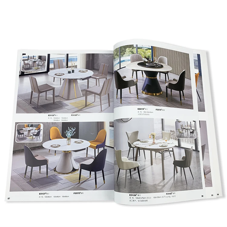
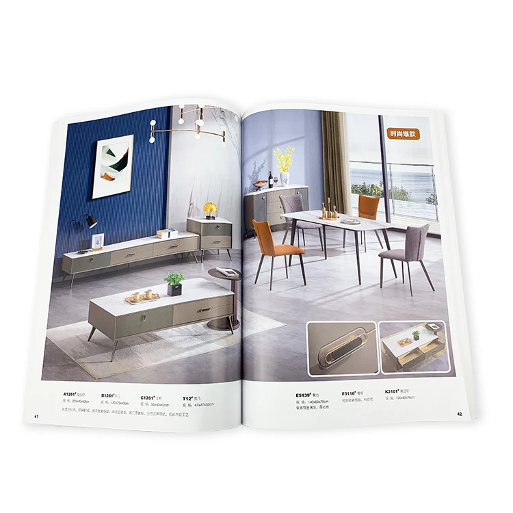
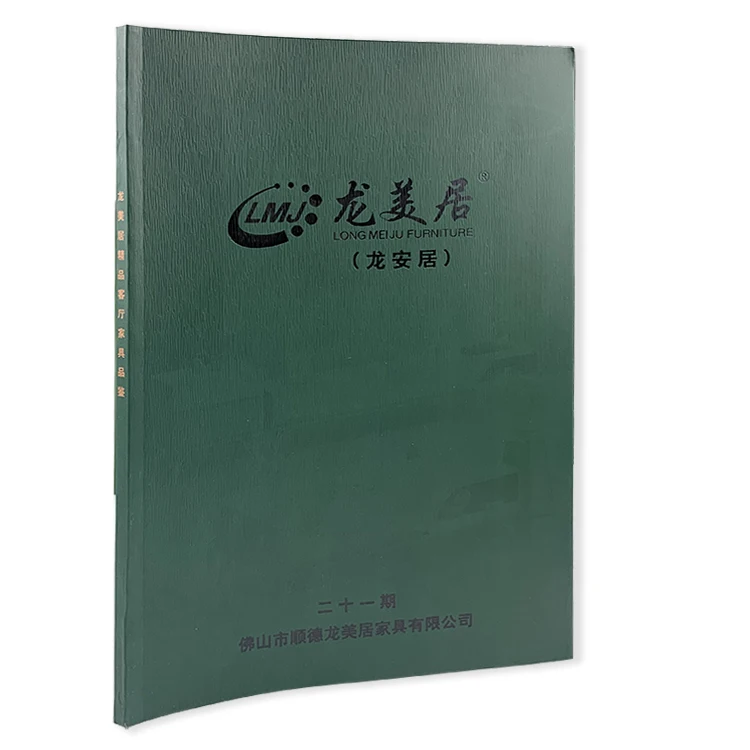
Product Description
Specification
Name | Catalogue Printing |
Type | C2P-MLS001 |
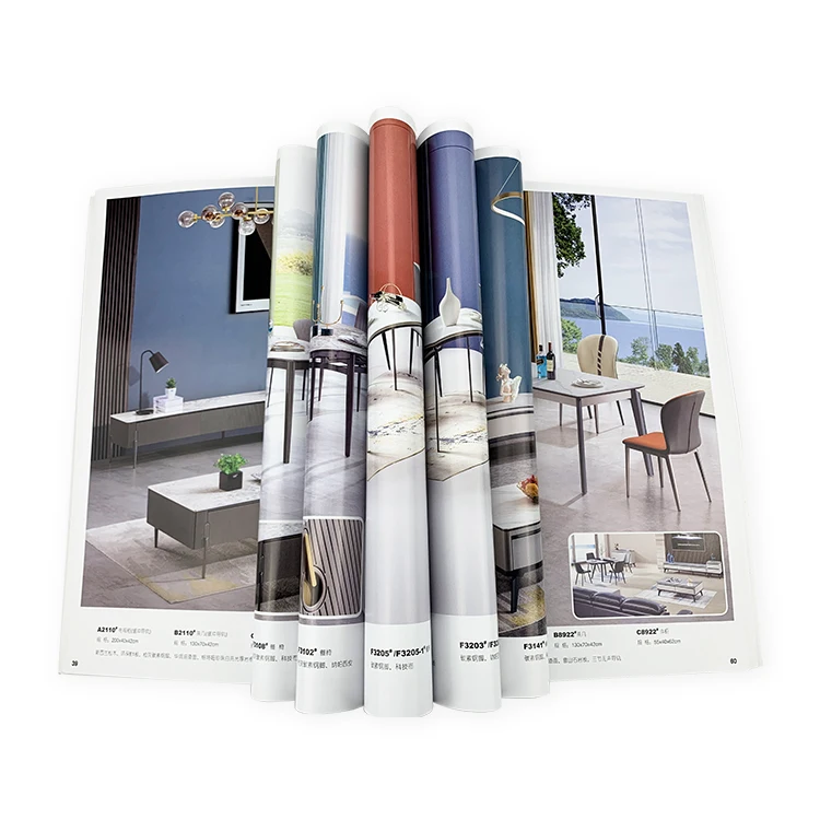
Material | Coated art paper,matte paper,Offset paper,whiteboard,special paper etc. |
Size | A3/A4/A5/A6; According to customer's requirements |
Color | CMYK As Per Pantone Or As Customers' Requests |
Logo | Accept Customized Logo |
Surface finish | Glossy/matt lamination,hot stamping,embossing,UV coating etc. |
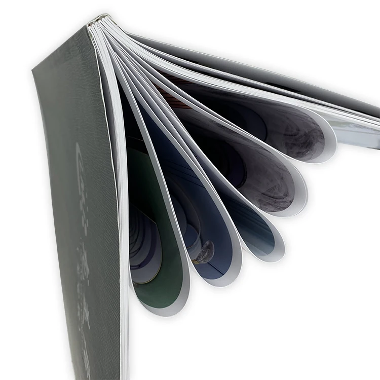
Binding | Saddle Stitch,Perfect Binding,Thread Sewing binding,Casebound Binding,Spiral Binding |
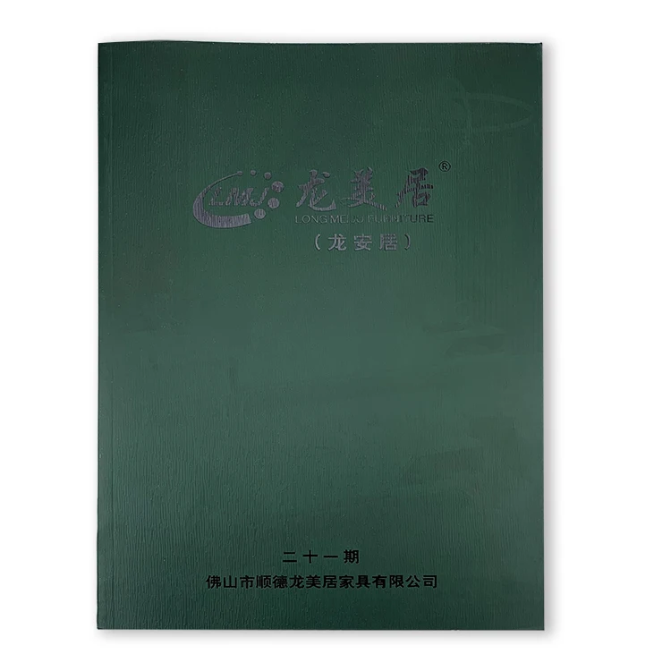
Usage | Hardcover book,children's book,cookbook printing,Brochure Printing |
Artwork Format | CDR format X4 version,AI,Pdf,Jpg,PS, TIF |
Payment terms | T/T, LC, Western Union, all for your choice |
Production Lead Time | 15day(After the printed document is confirmed) |


Company Profile

Production Process

Certifications


Packing & Delivery


To better ensure the safety of your goods, professional, environmentally friendly, convenient and efficient packaging services will be provided.
FAQ
Q1:\tWhat information should I give to get a quote?
A:\tYou need to clarify the specs, quantity and shipping address for us to quote you.
\t
Q2:\tCan you make free samples?
A:\tWe can provide samples, the samples are digital quick printing, only confirm the paper and proofreading text, not for color reference.
\tIf you have strict color requirements, it is recommended that you pay additional sample fees. We will customize the proof sample for you and send it to you. After confirmation, we will print according to the sample.
\t
Q3:\tWill there be color difference?
A:\t1.About the color difference between the display and the printed matter
\tThe display is an RGB display mode, which is composed of red, green, and blue light into various colors. Different displays and the same display show very large color differences in different environments.
\tOffset printing is a CMYK presentation mode, which is composed of cyan, magenta, yellow, and black inks to form various colors. The color difference of the display is less than the combination of red, green and blue. Therefore, there will be a certain color difference between the non-professional monitor and the printed matter. Please do not use the color on the monitor to proofread or compare the printed matter.
2.About the color difference between the same batch
Due to the volatility of offset presses, there will be slight color differences between the same batch of printed matter. We use a pre-ink supply system to ensure that the color is within the fluctuation range as much as possible, but there will still be color differences
\t3.About Pantone
\tDo not use three spot colors in each design file. Because the printing process of spot colors is more complicated than that of four colors, the color difference is greater than that of four colors
\t3.About Pantone
\tDo not use three spot colors in each design file. Because the printing process of spot colors is more complicated than that of four colors, the color difference is greater than that of four colors
Q4:\tHow to avoid chromatic aberration as much as possible?
A:\t1.Please use professional design software, recommend using Adobe CS suite to complete the album design;
\t2.Before the start of the album design, check the color settings of the design software to ensure that the software configuration is normal;
\t3.Try to use as little as possible to produce obvious color difference colors, such as blue-purple, brown and then gray when designing, use black, avoid using three-color gray;
\t4.When using special paper, please try to simplify the design content, use more single-color, solid lines or text, and avoid large-area multi-color overprinting and four-color images.
\t5.The colors produced by screen software or inkjet proofing cannot be used as printing color samples. For those with strict requirements on colors, please provide standard printing color samples.
\t6.The same document is printed in different batches due to the ink control problem, and the color difference is different, and the color difference of about 5%-10% is normal.
\t
Q5:\tStill can’t find the answer.
A:\tPlease email us and we will try to help.


